VERISH
DEC 2021 - APR 2022
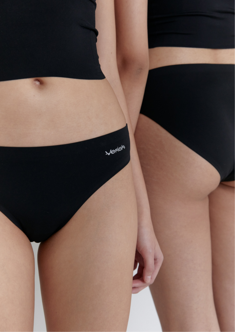
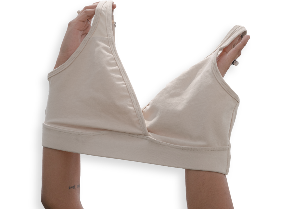
베리시는 변화하는 대한민국 여성들의 라이프스타일을 기반으로 시작하여 2021년 2월 런칭한 여성 언더웨어 브랜드입니다.
정체된 기존 오프라인 기반의 언더웨어 시장의 한계를 인식하고 고객의 PAIN-POINT를 통하여 제품을 기획 개발하고 있습니다.
또한, 단순 언더웨어 시장에서 멈추는 것이 아니라 라이프스타일을 중심으로
에슬레져, 이지웨어, 바디케어 제품 등 다양한 영역으로 브랜드를 확장할 계획입니다.
It started with the changing lifestyles of Korean women and launched in February 2021 It's a women's underwear brand. Recognizing the limitations of the traditional offline-based underwear market, We are planning and developing products through PAIN-POINT. And it's not just about stopping in the underware market, it's about lifestyle We are planning to expand our brand to various areas such as esleger, easyware, and body care products.
Project Issue
기존에 베리시는 여성 언더웨어를 중심으로 시장에 타겟하여 골프 전용 이지웨어, 심리스 언더웨어 등으로 대중들에게 브랜드 인지도를 쌓는데에는 성공했지만,
이미 구축된 여성성이 강한 브랜드 아이덴티티로 인해 라이프스타일 카테고리로 확장하는 것에 제한적인 포지션을 가지고 있었습니다.
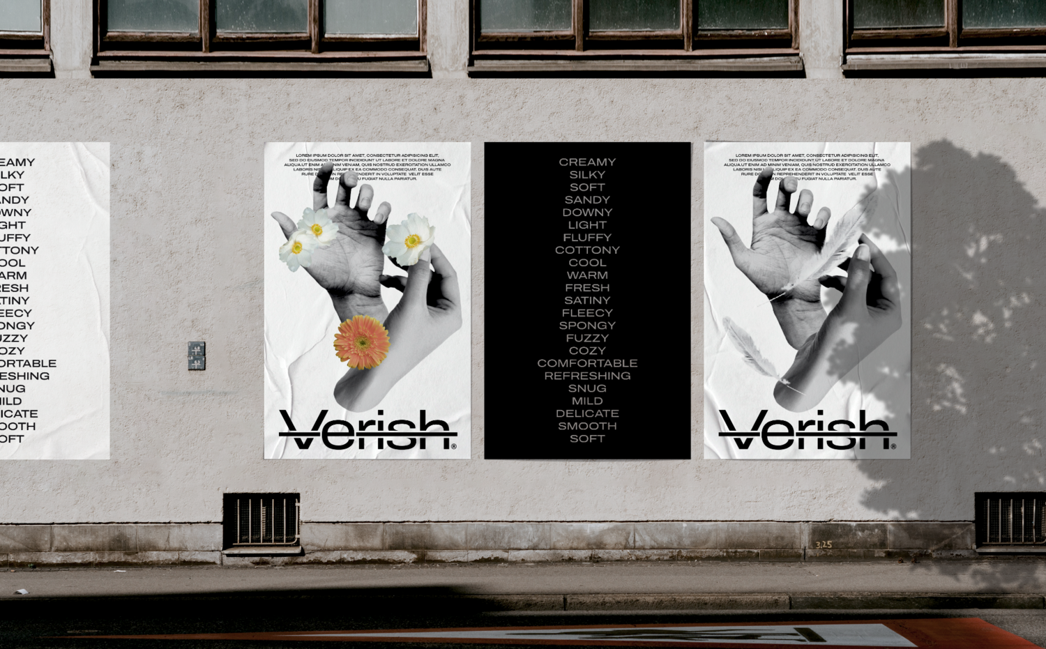
이를 개선하기 위해 브랜드가 원초적으로 가지고 있던 ‘촉감 우선주의’라는 메세지를 중심으로 보다 확장성있는 아이덴티티 개발이 필요했습니다.
이를 위해 베이스 컨셉을 강조하며, 브랜드 스트럭쳐를 새롭게 정의하는 에센스를 개발합니다.
Previously, Verish succeeded in building brand awareness to the public with golf-only easy wear and seamless underwear by targeting the market with women’s underwear, but had a limited position to expand to lifestyle content due to the already established brand identity. To improve this, it was necessary to develop a more expandable identity, focusing on the message of “touch priority” that the brand originally had. To this end, we develop an essence that emphasizes the base concept and redefines the brand structure.


Brand Motif System
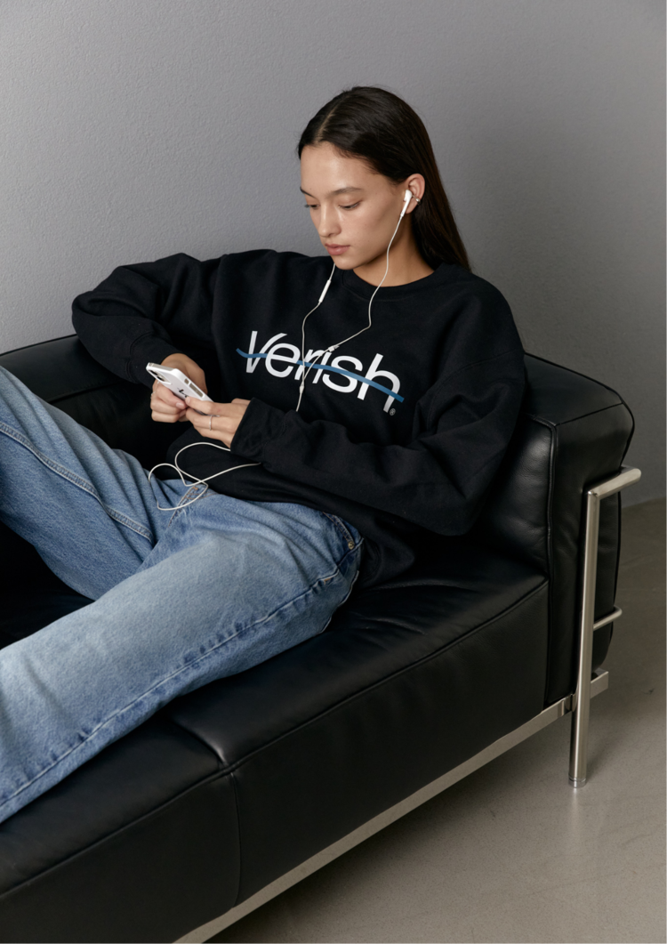
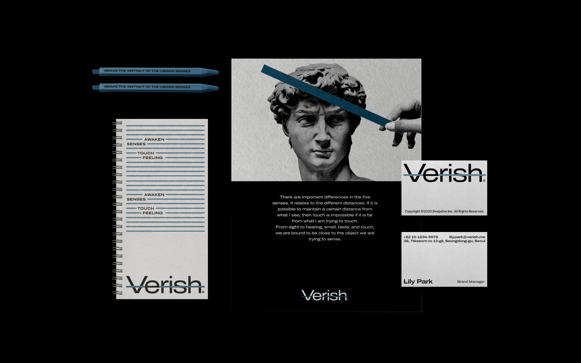
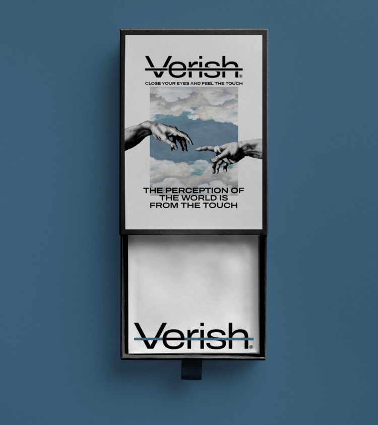
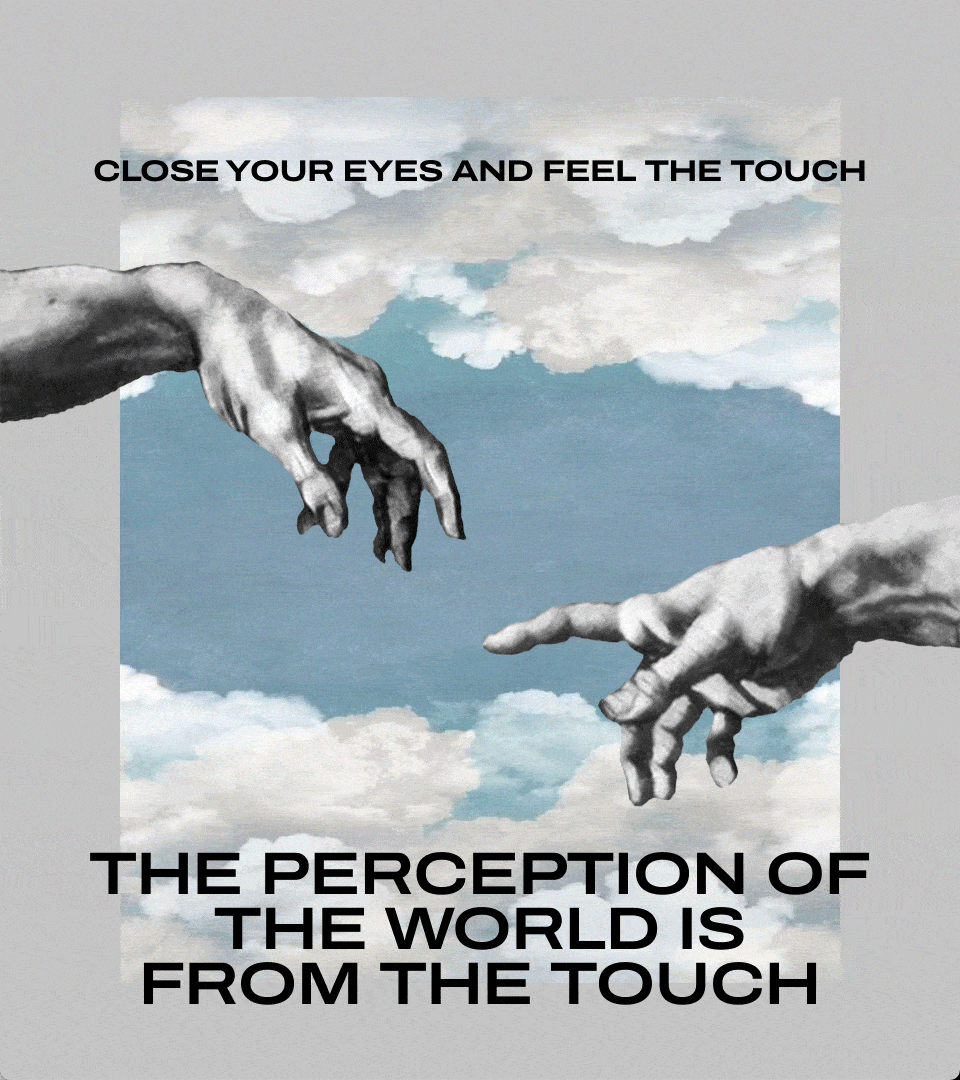
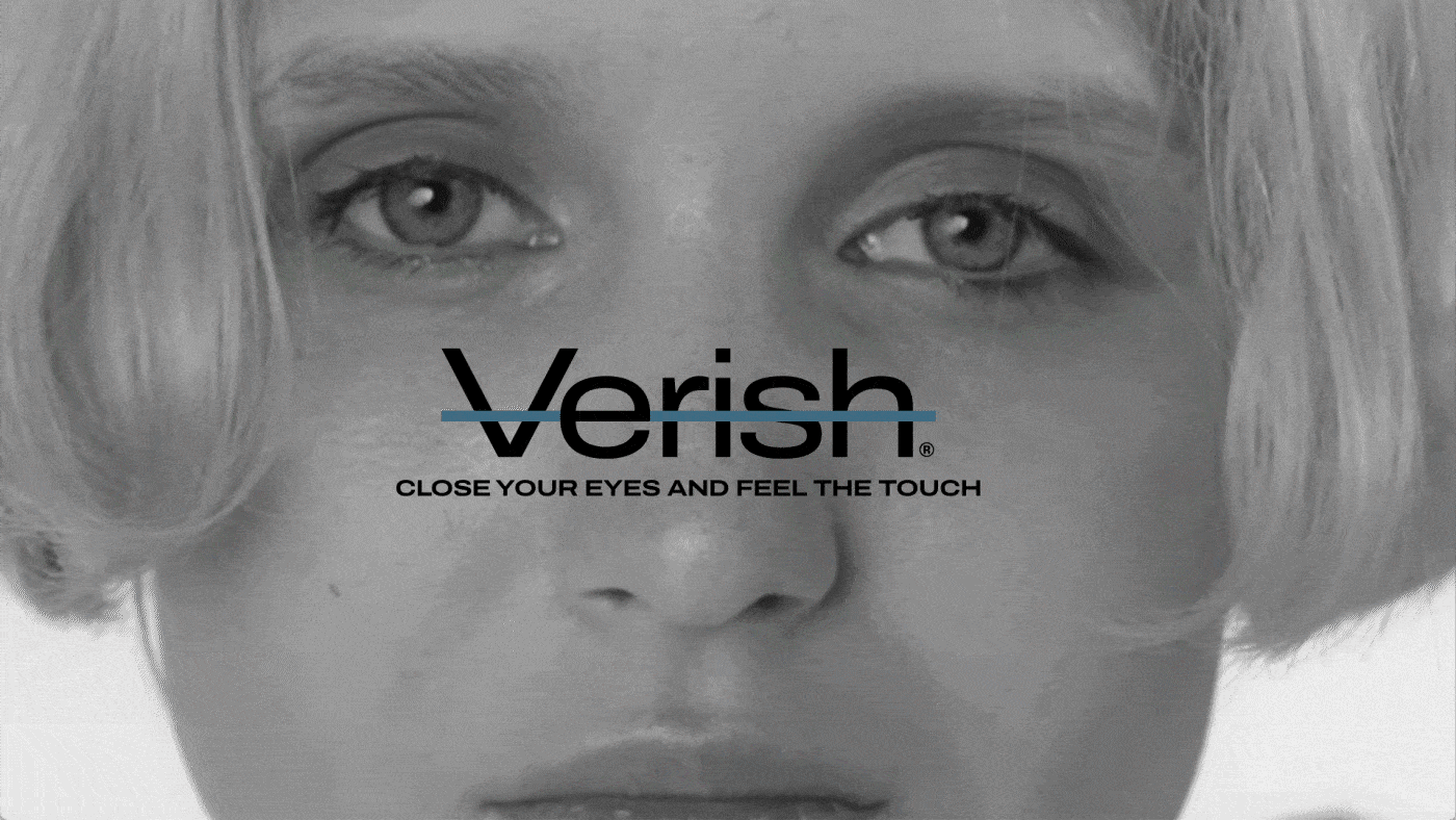
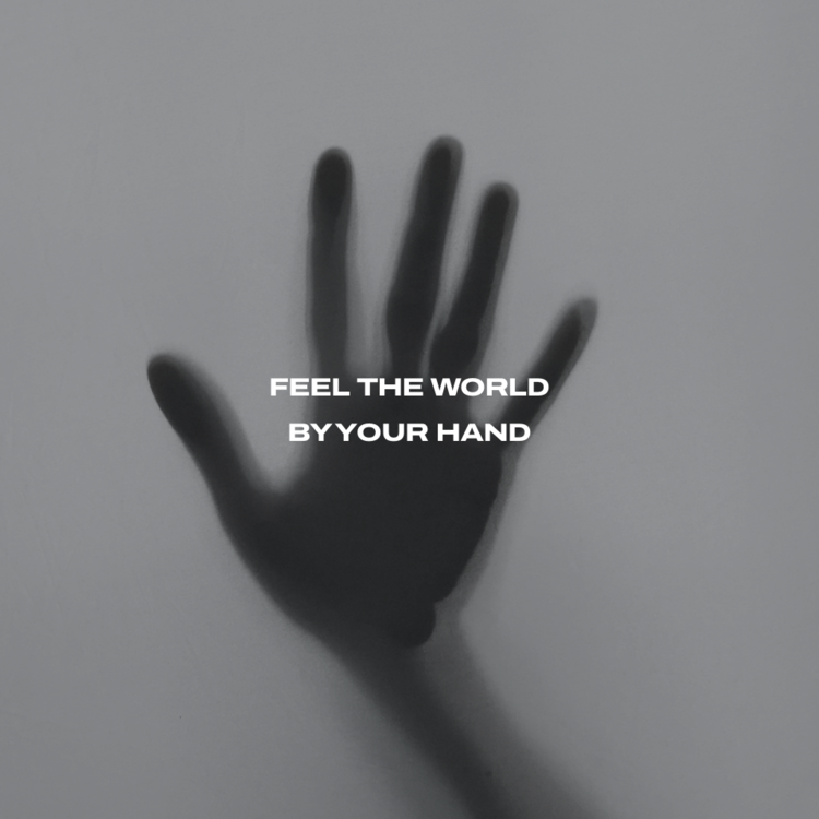
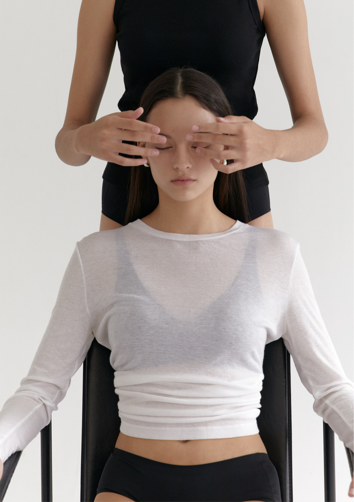
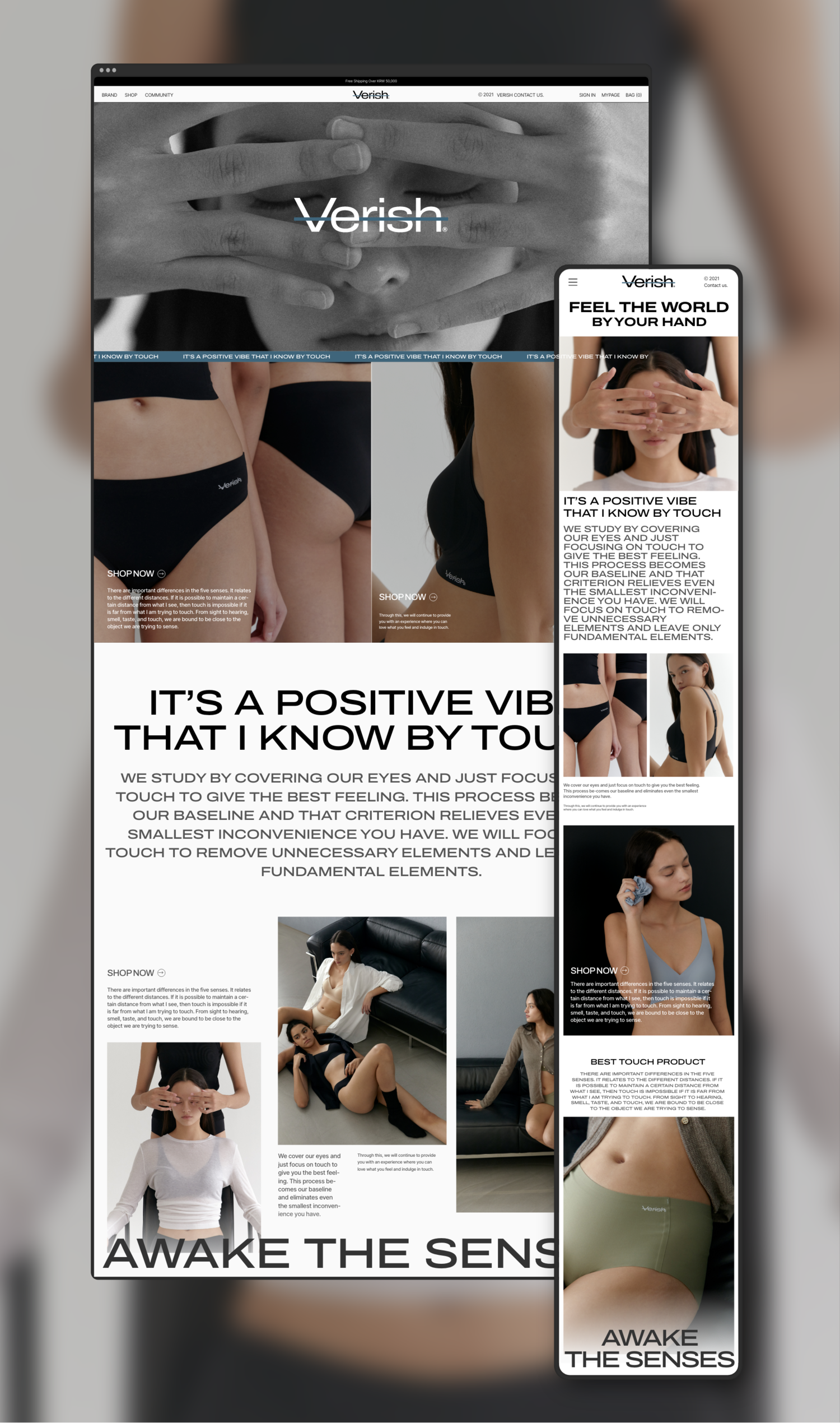
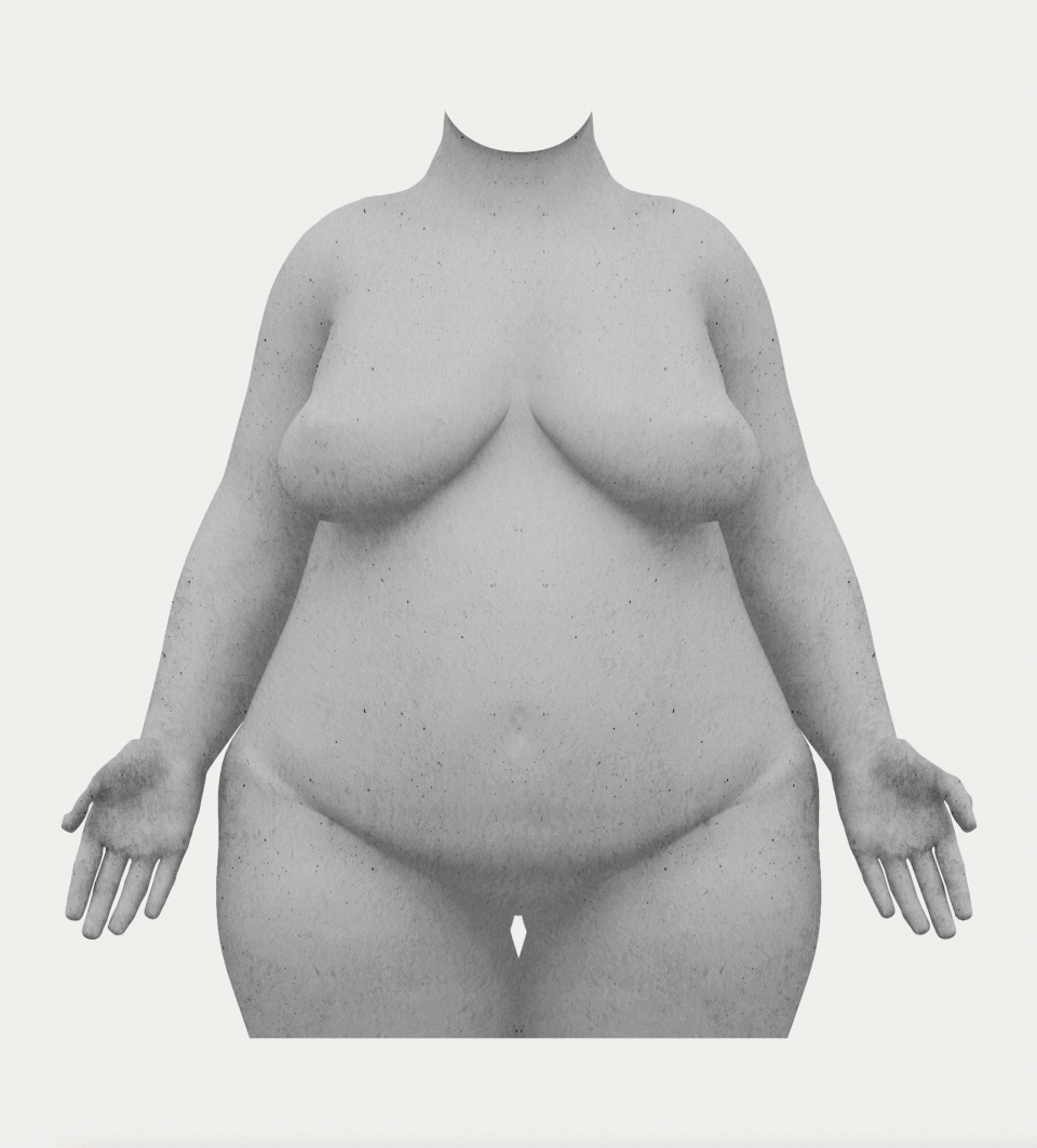
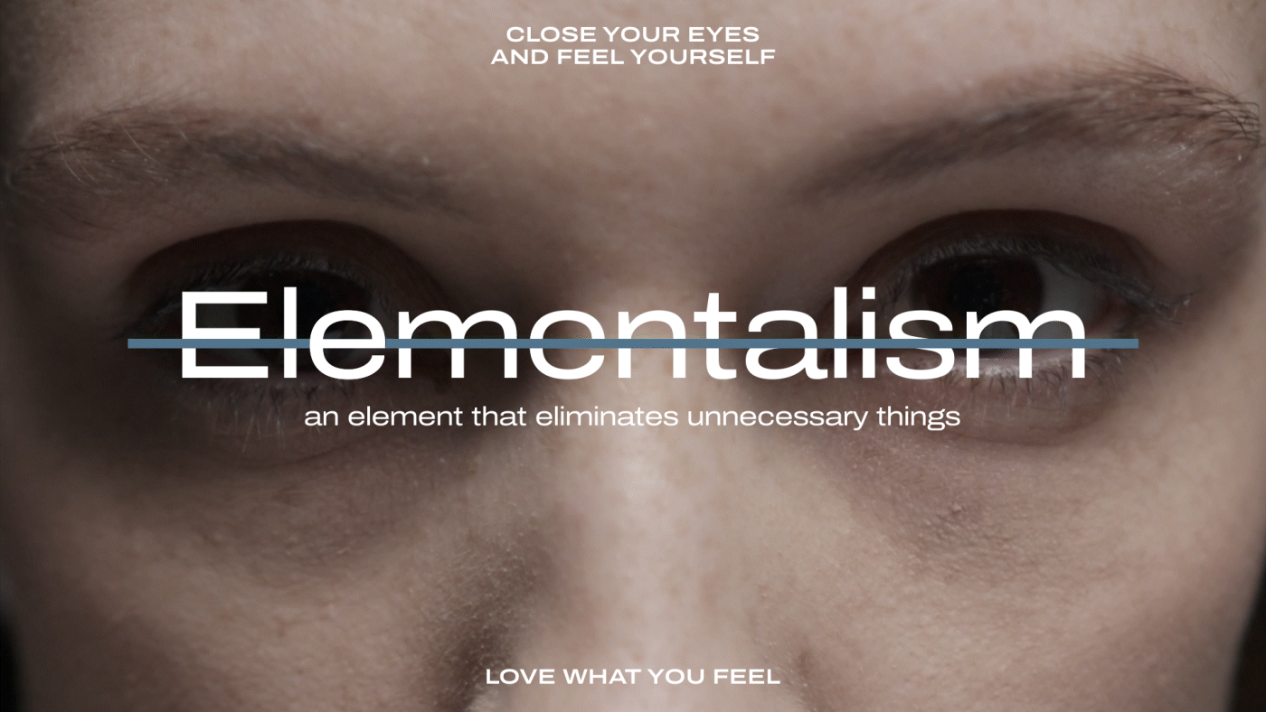
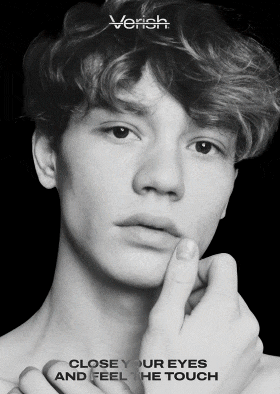
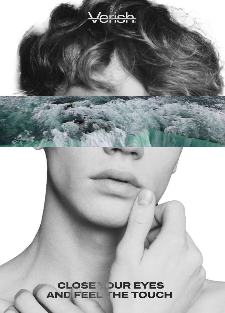
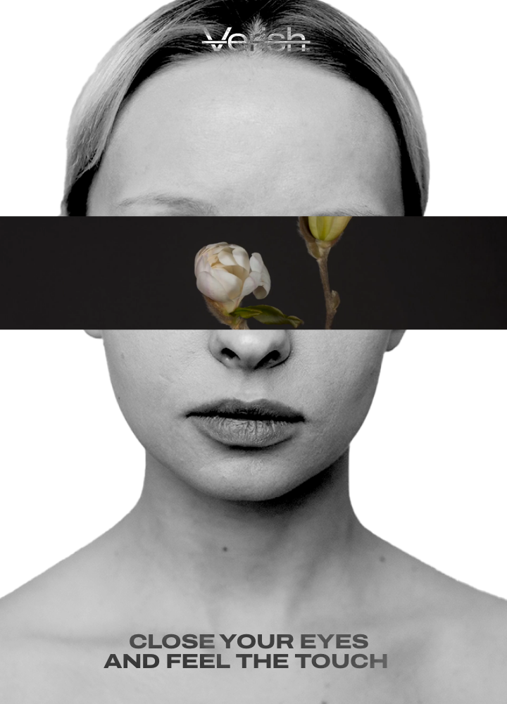
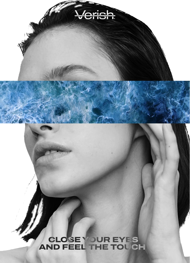
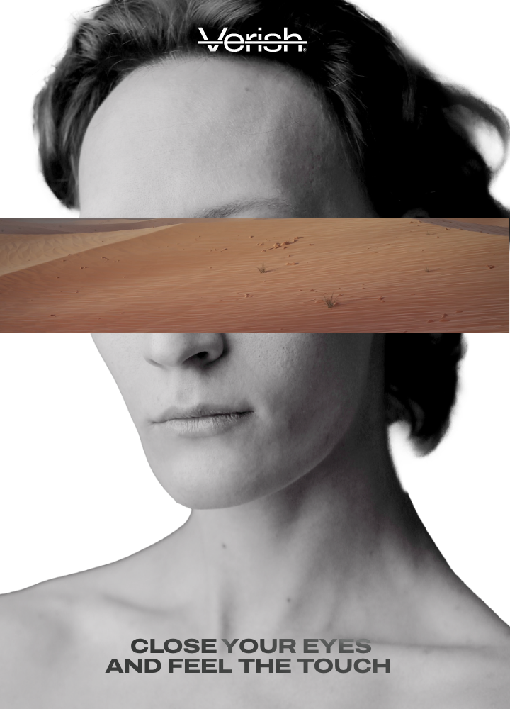
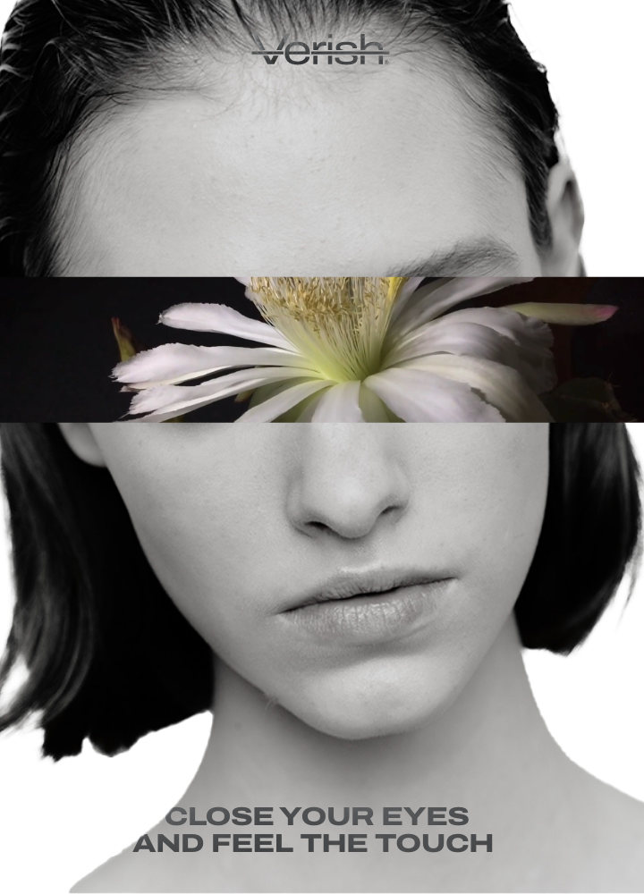
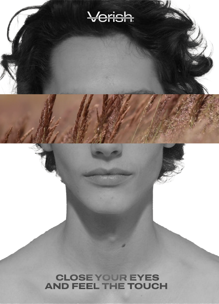
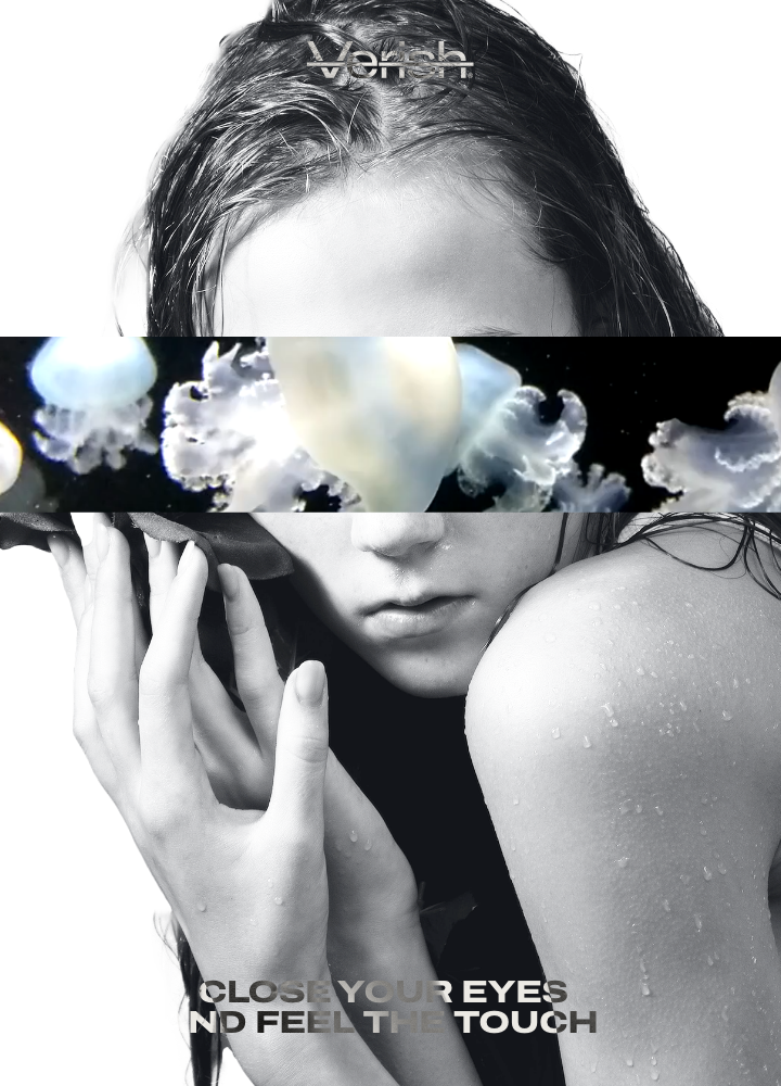
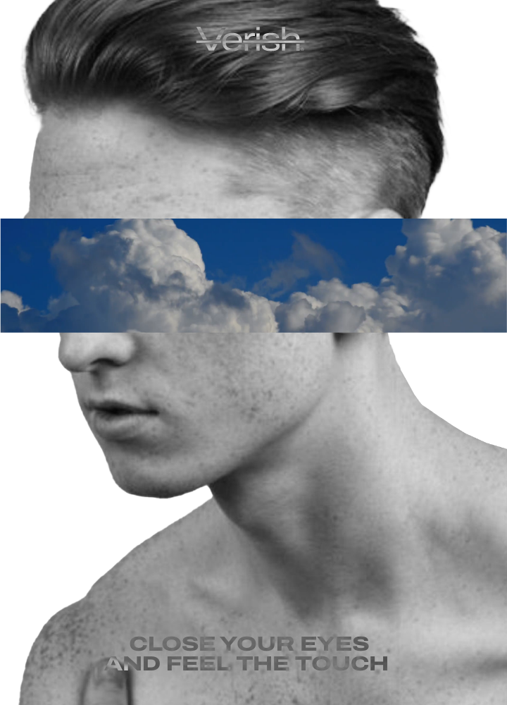
눈을 가리고 촉감에 집중해 진정한 바디 포지티브를 행하고자 하는 브랜드 컨셉에 맞춰 '블라인드 테스트'에서 그래픽 모티프를 추출합니다.
브랜드가 전개하는 다양한 비주얼과 퍼포먼스에 일관되게 적용되는 그래픽 모티프는 단순히 눈을 가린다는 의미를 넘어 그안에서 느껴지는 다채로운 경험과 감각의 존재를 암시합니다.
Extract graphic motifs from the Blind Test to match the brand concept of blindfolded, focused on touch and true body positives.
The graphic motif, consistently applied to the various visuals and performances of the brand, goes beyond simply covering the eyes and implies the existence of a variety of experiences and senses felt in it.

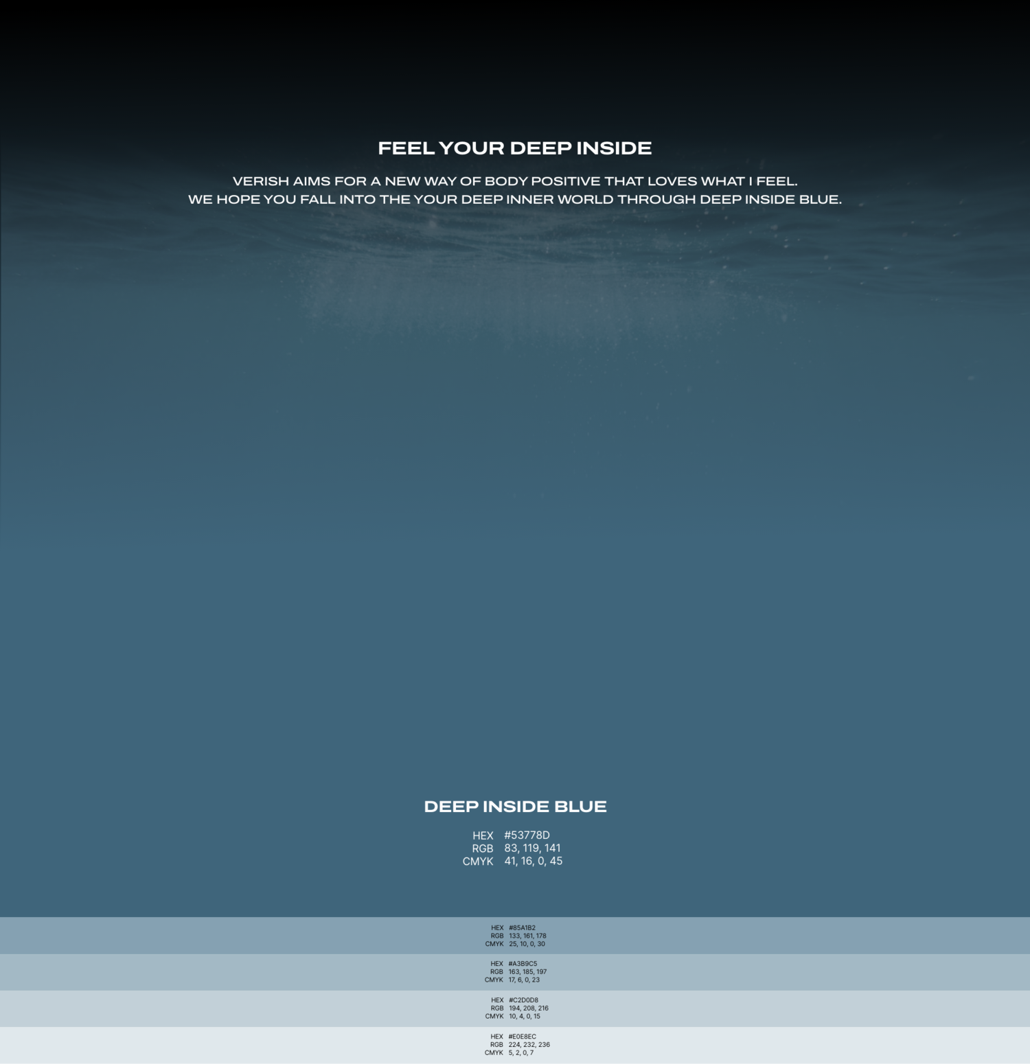
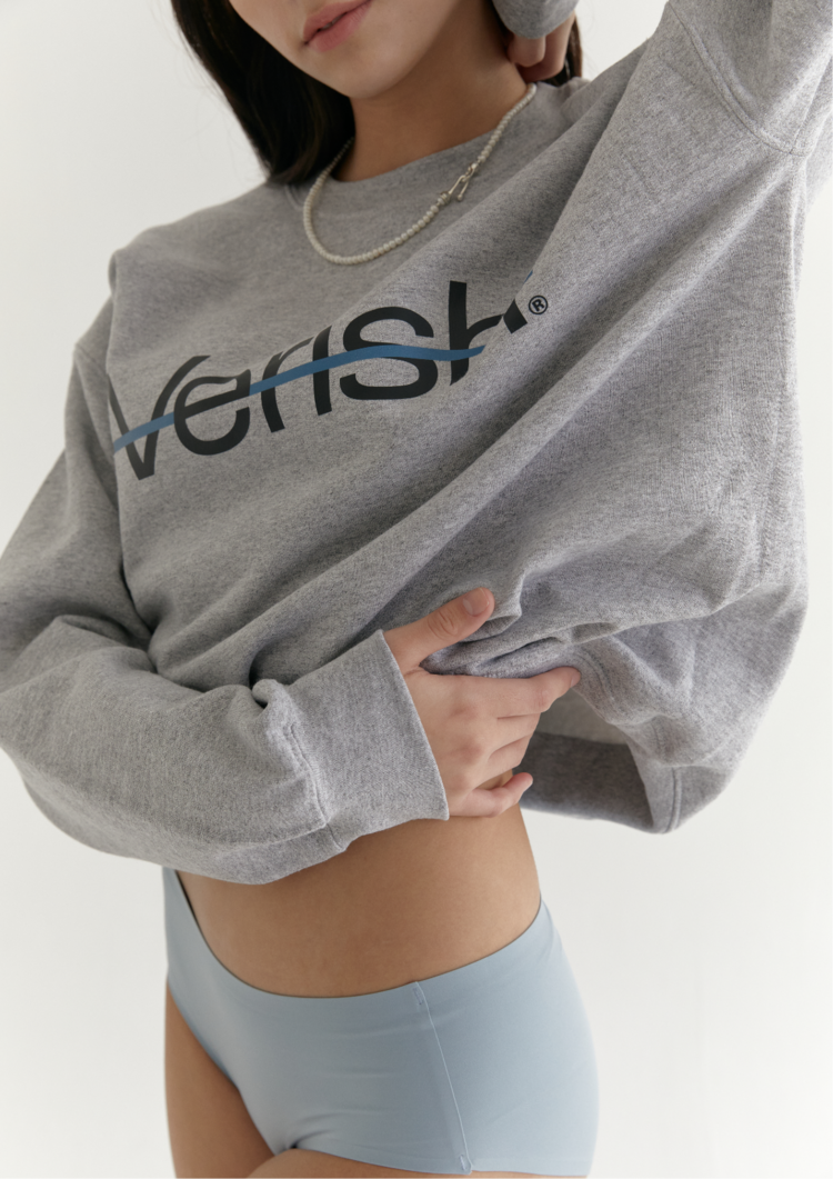
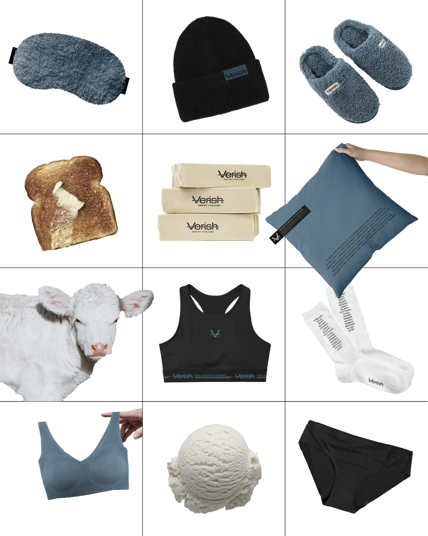
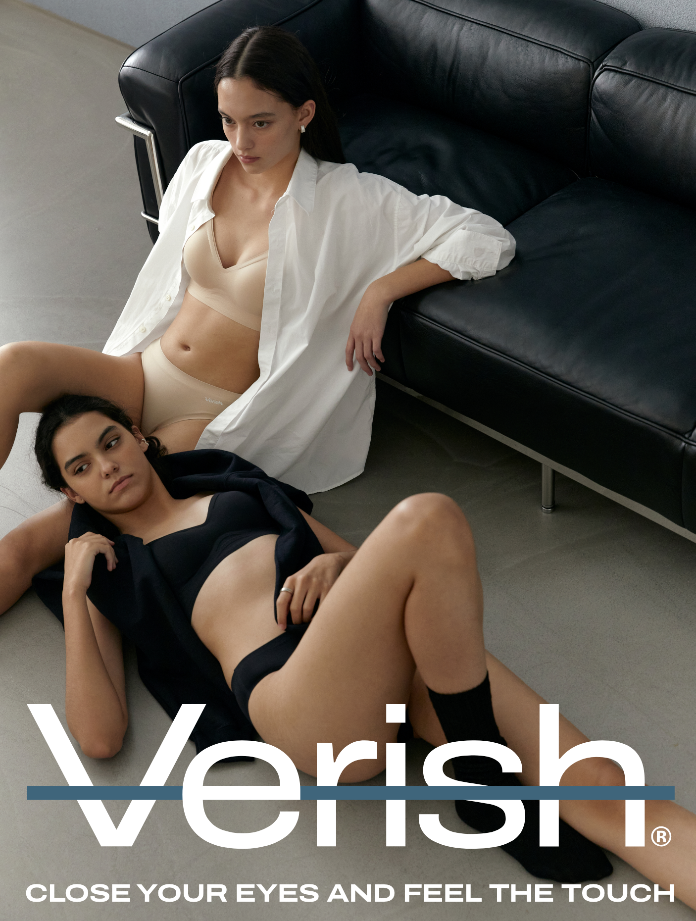
Brand signature Color
베리시의 시그니처 컬러는 확장성 높은 컬러를 중점으로 설정합니다.
기존 여성성이 두드러지는 버건디 톤과 레드 섹션의 컬러 플레이에서 벗어나, 중립적인 정서를 가진 뮤트 블루 톤을 선정하여 지속가능한 브랜드 에센스로 활용합니다.
Previously, Verish succeeded in building brand awareness to the public with golf-only easy wear and seamless underwear by targeting the market with women’s underwear, but had a limited position to expand to lifestyle content due to the already established brand identity. To improve this, it was necessary to develop a more expandable identity, focusing on the message of “touch priority” that the brand originally had. To this end, we develop an essence that emphasizes the base concept and redefines the brand structure.